DATA BY DESIGN
An Interactive History of Data Visualization
1786-1900
1786-1900
What is the story we tell about the emergence of modern data
visualization?
How might we tell that story differently?
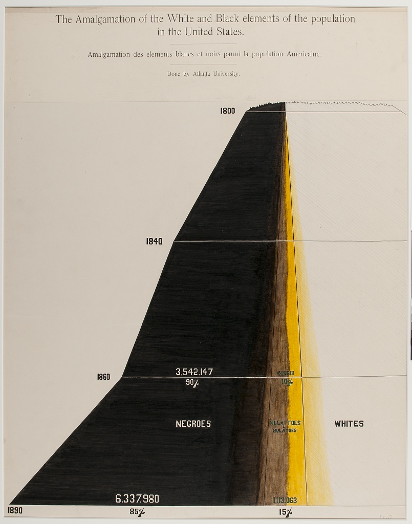
The Amalgamation of White and Black elements of the population in the
United States by W.E.B Du Bois. Atlanta University. Library of
Congress.
Some Words From Lauren
Some more text Additional research for this project was completed through
fellowships from the American Antiquarian Society and the Library
Company of Philadelphia.
Read More ->
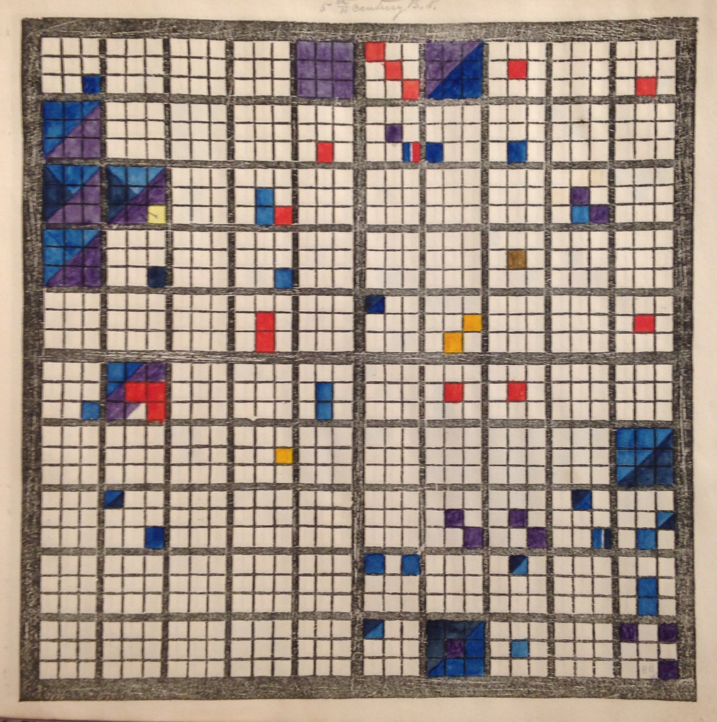
A student chart from The Polish-American System of Chronology by Anonymous
1850
Courtesy of the American Antiquarian Society. Photo by the author.
peabody ->
CHAPTERS
Every Datapoint a Person
The Brooks / Diagram of a Slave Ship
Before there are data, there are people. People who offer up their
lives as data -- or whose lives become data without consent.
What Visualization Reveals
William Playfair's Time-Series Charts
Data visualization has never been neutral or objective. There is a
meaning -- and an argument -- conveyed through each design.
Narratives of Possession
Emma Willard and Shanawdithit’s Narrative Maps
Maps can create nations and contest them.
How have maps been used to document multiple pasts?
How have maps been used to document multiple pasts?
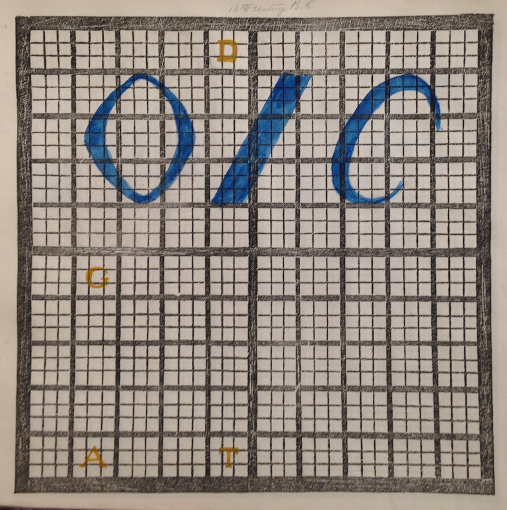
The Work of Knowledge
Elizabeth Palmer Peabody’s Chronological Grids as Argument
We have come to believe that data visualizations should be clear and
efficient. Is there value in designs that make us pause and
reflect?
Between Data and Truth
W. E. B. Du Bois’s “Data Portraits”
How can data visualization bear witness to oppression? How can it hold
space for what cannot be conveyed through data alone?
Labour
W. E. B. Du Bois’s “Data Portraits”
How can data visualization bear witness to oppression? How can it hold
space for what cannot be conveyed through data alone?